


Well, this is interesting…
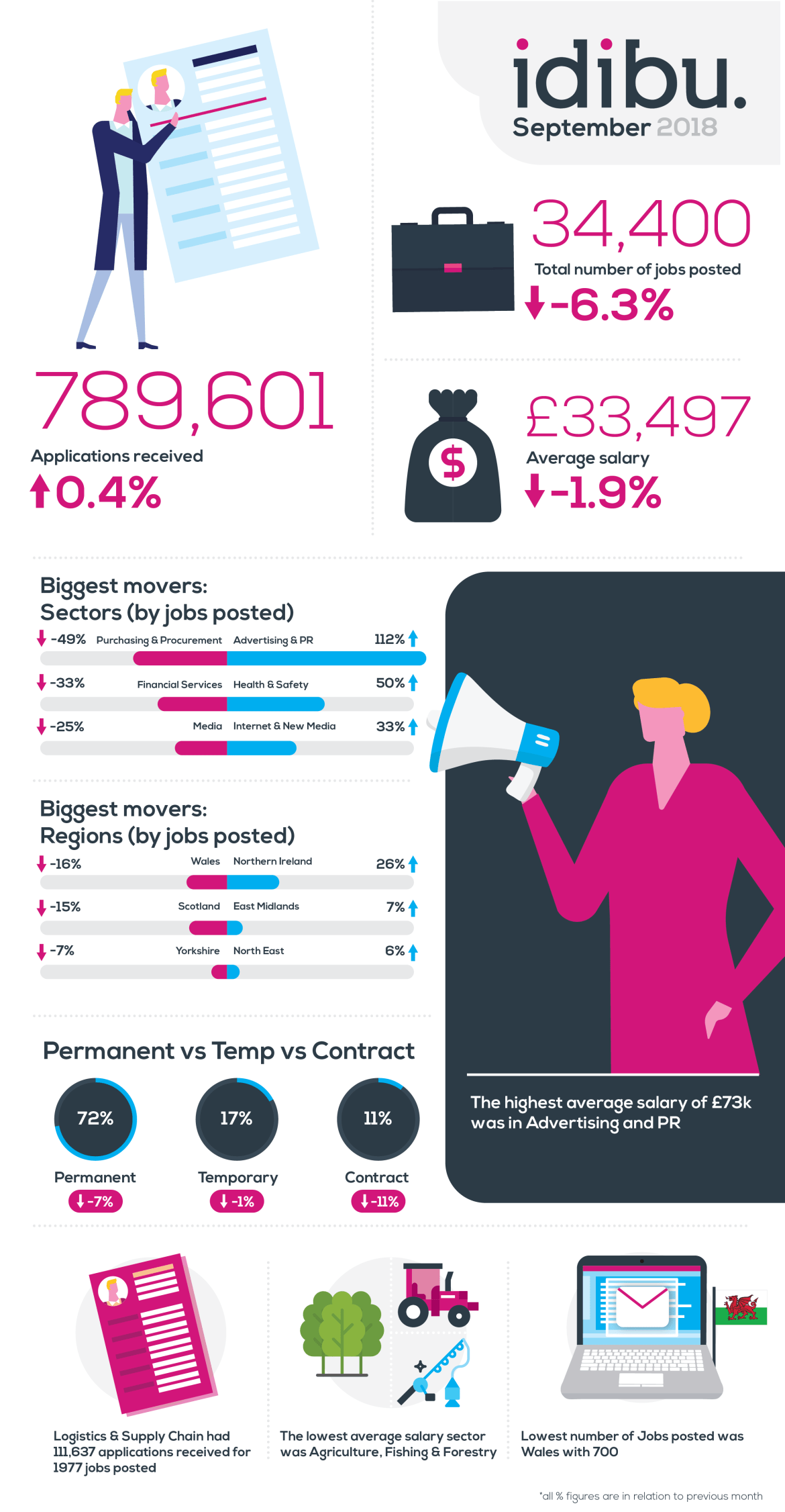
We’ve spent the last month collating all the data that’s pumped out of idibu each month to create an overview of the job market. Our infographic shows new jobs posted and how many applications have been received across various sectors and regions. The figures below are from September, which gives us the following month to fully capture all incoming job applications.
We’ll be creating these infographics every month so it should be really interesting to see the trends and movers over time.


No Comments Yet
Let us know what you think